My friend Iona has been one very lucky duck and has been travelling throughout Canada and parts of America over these past few weeks. She has been sending back some amazing photos that have made those of us sitting here in rural Australia freezing our butts off very jealous (but also very happy for her). She mentioned a little while ago that she wished she had invested in a better camera for her architectual shots. So I began wondering what tips I could give Iona to perhaps improve her photos for this trip. Then one day it occurred to me- polarisation.
I looked up Wiki to try and get a good explanation of a polarisation filter and what it does, but got a whole heap of stuff about light waves and reflective bounce (YAWN), so I will simplify. A polarisation filter makes the sky a darker blue. However, there is a way to get a similar effect, that will not be as pronounced, but still will give you a nice shade of blue on your compact. If nothing else, it will give you a good shade of blue to tweak in Photoshop.
Before composing your shot, you need to find the best angle for polarising light. To find this simply point your fore finger at the sun and your thumb at the sky. Rotate it left to right. The arc that your thumb points out will be the best area to shoot towards to make the sky blue.
 Hopefully that helps. I also have some examples to show how effective this simple technique can be. Both of these photos were taken by me in Bruges last year.
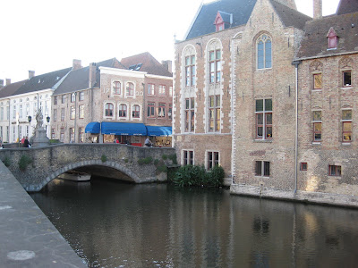 This first image is shooting to the west at sunset. You can see the sky is very washed out, with no blue at all. The camera struggles with the light elsewhere in the shot.
 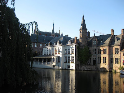 By turning 90 degress- not even taking a step- the lighting is completely different. The sky has a nice vivid blue to it. At the same time, this angle gives nice shadows and texture to the buildings and provides reflections on the water. The colours in the brick are much richer.
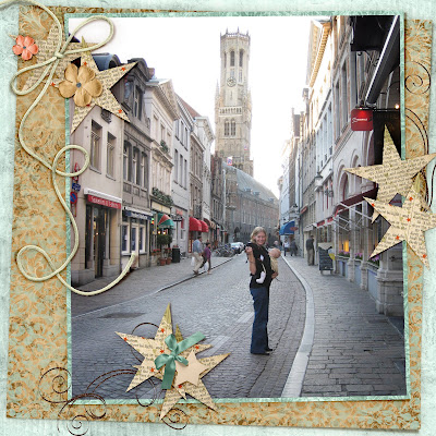
 And as a special thank you to Iona for giving me the idea for this post and for allowing me to use her as an example, I have boosted the colours (and done some other stuff) to one of her photos that unfortunately my advice came too late for, but I know she loves this image.
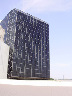
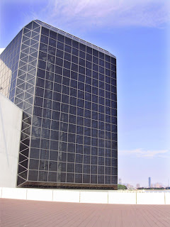


Credits: Iona, 'A Double Helping of Pei'
Thank you Iona!


